Helpline Software
Led UX Research, Content Strategy, Design, and Implementation of a B2B website leading to a 97% increase in website traffic and a 178% increase in user engagement.
Executive Summary
I led UX research, content strategy, and redesign for a B2B hotline software platform, enhancing usability and engagement. Through research-driven design and optimized content, I created a clear, intuitive user experience
Key Accomplishments
Conducted comprehensive UX research to uncover user needs and pain points.
Seamlessly integrated stakeholder feedback, competitive analysis, and heuristic evaluations to iteratively enhance the user experience.
Revamped information architecture to boost content discoverability and overall usability.
Elevated visual design, crafting a clean and user-centric interface grounded in research insights.
97% increase in website traffic and a 178% boost in user engagement, accompanied by favorable stakeholder feedback.

HelplineSoftware.com offers software solutions for 24-hour hotlines.

Responsive B2B Website Design
Identified an opportunity to enhance the user-friendliness and content of my former DS manager's website, aiming to attract a broader client pool and increase customer engagement.
Project Duration
Executed the project within one month, encompassing UX research, design iterations, and final implementation.
My responsibilities
UX research (stakeholder interviews, competitive analysis, heuristic evaluations)
Responsive design in Figma through several iterations.
Collaboration with stakeholders.
Implementation of the final design in CMS platform; WordPress.
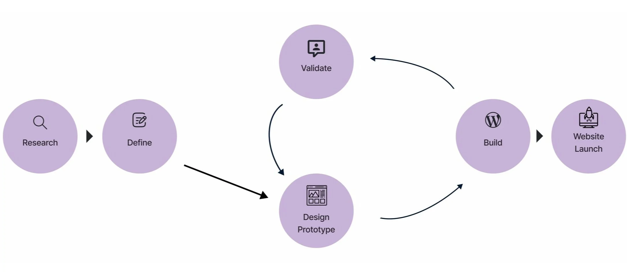
Design process showcasing the iterative stages of user research, ideation, prototyping, testing.
UX Process
Employed a user-centered design methodology, integrating user research, content strategy, ideation, prototyping, testing, and validation. This iterative approach ensured the creation of clear, user-friendly solutions grounded in research insights.

Overcoming UX Research Challenges
Problem:
Faced constraints in conducting direct user interviews or usability studies with business clients because stakeholders were hesitant to reach out to them.
Solution:
Adopted alternative qualitative and quantitative research methodologies to gather actionable insights:
Stakeholder Interviews: Through weekly stakeholder meetings, I gained a holistic understanding of the project’s context and gain valuable insights.
Competitive Analysis: Analyzed competitor websites, to identify user expectations and inform content strategy and design improvements.
UX Heuristics: Applied general UX design principles to check the website's usability, and gathered feedback from stakeholders to ensure alignment with business goals.
Stakeholder Interviews
Conducted weekly stakeholder meetings to develop a comprehensive understanding of the project and gather valuable insights.
Requirements and expectations: Provided an overview of the website and facilitated discussions on stakeholder feedback and goals.
User insights: Identified user behaviors, preferences, and pain points by gathering stakeholders' input on their target users.
Project scope: Defined key features, content strategy, and design functionalities to align with stakeholder objectives and user needs.
Timeline: Committed to completing the project before the End Violence Against Women International Conference to ensure accessibility for attendees.
Content Consistency: Red circles indicate stakeholder-approved word choices.
SWOT Analysis: Assessing Strengths, Weaknesses, Opportunities, and Threats
UX Competitive Analysis
Evaluated the strengths, weaknesses, opportunities, and threats to identify areas for improvement and develop strategies to optimize the user experience.
Competitor Websites
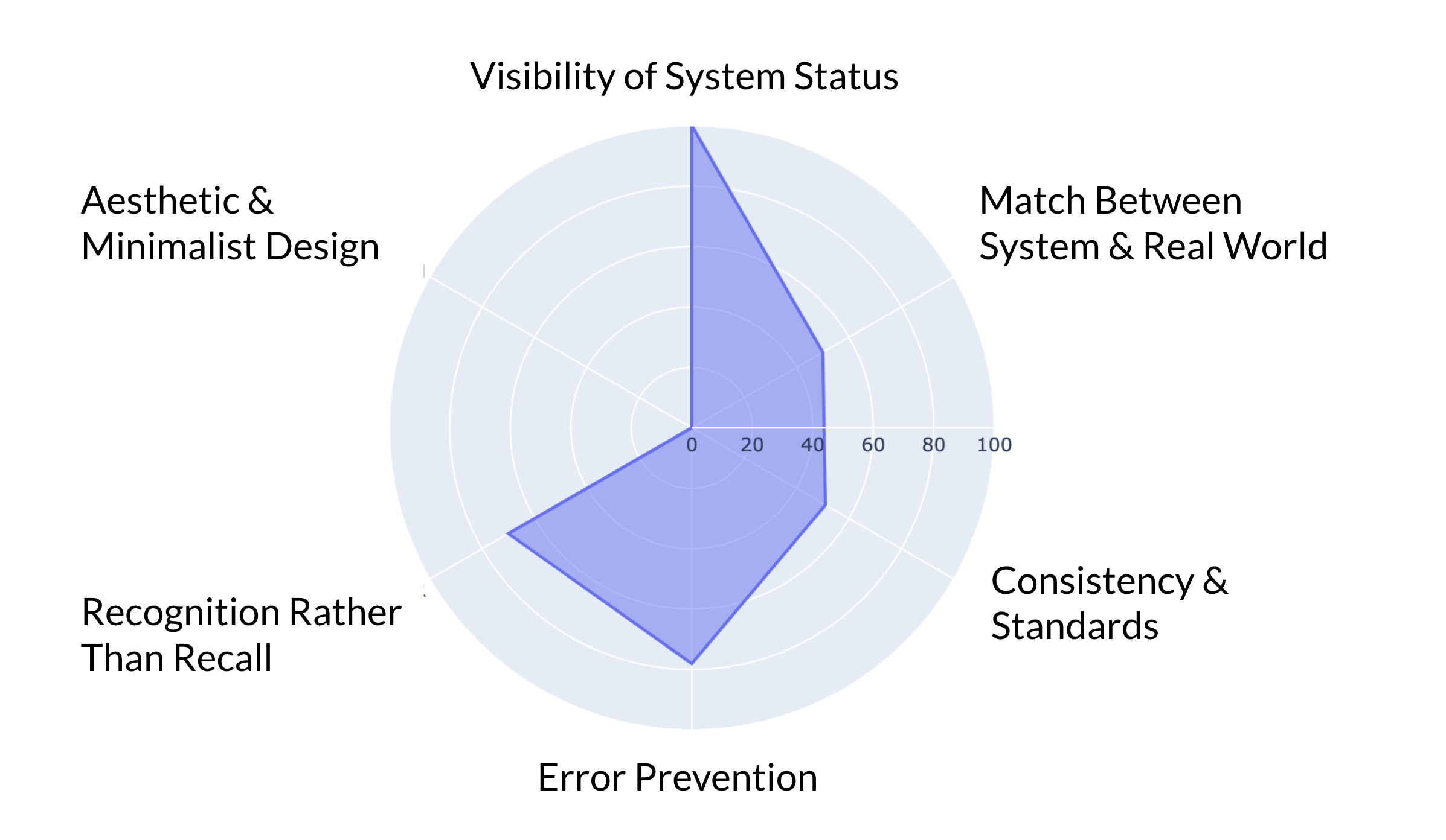
Usability Radar Chart showcasing the evaluation of the website based on usability heuristics. A score of 100 indicates full adherence to the heuristics, while a score of 0 suggests non-compliance.
UX Heuristic Analysis: Evaluating Usability Principles and Identifying Design Improvements.
UX Heuristic Analysis
Main Issues & Solutions
Match between the system and the real world: Simplify language, content, as well as navigation for better information architecture and design.
Consistency and standards: Ensure uniform design, maintain layout consistency, incorporate high-quality images, and reduce unnecessary text.
Recognition rather than recall: Integrate intuitive icons and labels to represent functions and options for better visibility.
Aesthetic and minimalist design: Apply a clean, clutter-free layout with clear typography for improved readability and user experience.

Key UX Improvements
Boost Information Architecture: Simplify complex content and improve the organization and structure for better navigation.
Add "How it Works" page: Provide clear technical details of the service by adding user-friendly content.
Improve mobile layout: Make it more intuitive for users.
Refine the main page: Improve top navigation, streamline content, and enhance the design for clarity and usability.
Design the "We Offer" Section: Highlight key product features effectively.
Highlight key statements: Enhance clarity and visual emphasis on critical information.
Introduce an Impact Section: Showcase testimonials and key impact statistics.
Create a Banner Ad: Promote the flash trial offer to increase engagement.
User Flow
Leveraging research, analysis, and ideation, I designed a streamlined website structure with a prominent homepage and strategically placed CTA buttons to guide users seamlessly. The clear call-to-action elements ensure effortless navigation, encouraging users to schedule a meeting with the business efficiently.
User flow for Helpline Software in the improved design
Aligning Stakeholders and Presenting UX Research Findings
Shared UX research findings with stakeholders to establish a common understanding, gather feedback, and align on next steps. Ensured open discussions to address concerns, refine solutions, and drive informed decision-making.
Key Feature Sketches: Highlighting the Software offered by the business.
UX Design Sketches
Created ideas for effectively presenting Helpline Software’s key features through detailed and interactive designs.
Developed initial sketches to facilitate rapid ideation, which was iteratively refined and transformed into high-fidelity prototypes in Figma for a polished user experience.
New Design Iteration with High-Fidelity Prototype
Enhanced UX content, usability, and design by conducting stakeholder interviews to understand key requirements, competitive analysis to benchmark industry standards, and heuristic evaluations to identify usability gaps.
Using these insights, I refined the design and content to align with user needs, creating an intuitive and visually appealing experience.
Before and After: New design implementation in Figma based on UX Research insights.
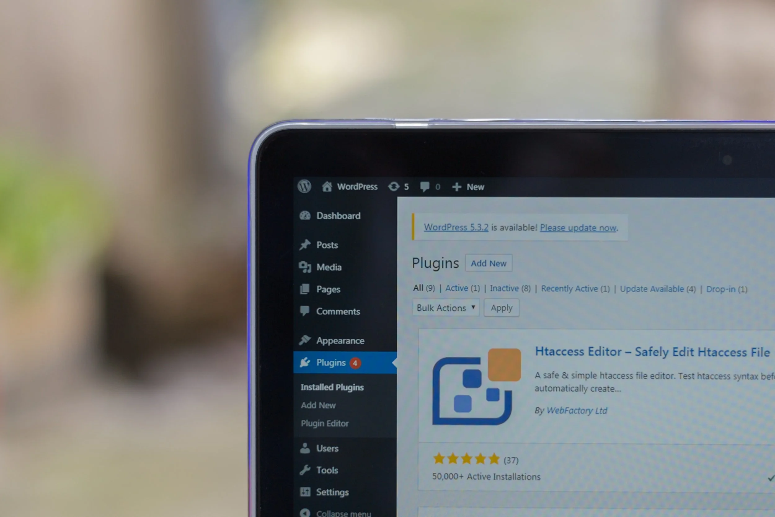
WordPress Implementation
Developed and launched a fully responsive and functional website in WordPress, ensuring it met project requirements and provided an optimal user experience.
Integrated stakeholder feedback, made final refinements, and successfully published the website: Helpline Software: https://helplinesoftware.com/.

Website analytics summary by Monster Insights.
Design Impact
Leveraging the Monster Insights plugin in WordPress, I analyzed performance metrics over two months, revealing significant improvements:
97% increase in website traffic
178% boost in user engagement
These results highlight the effectiveness of the UX improvements in driving user interaction and visibility.

Figma High-fidelity Prototype
Developed detailed, interactive product page mockups with realistic visual elements to enhance usability testing. The high-fidelity prototype enabled effective stakeholder feedback, ensuring alignment with user needs and business goals.